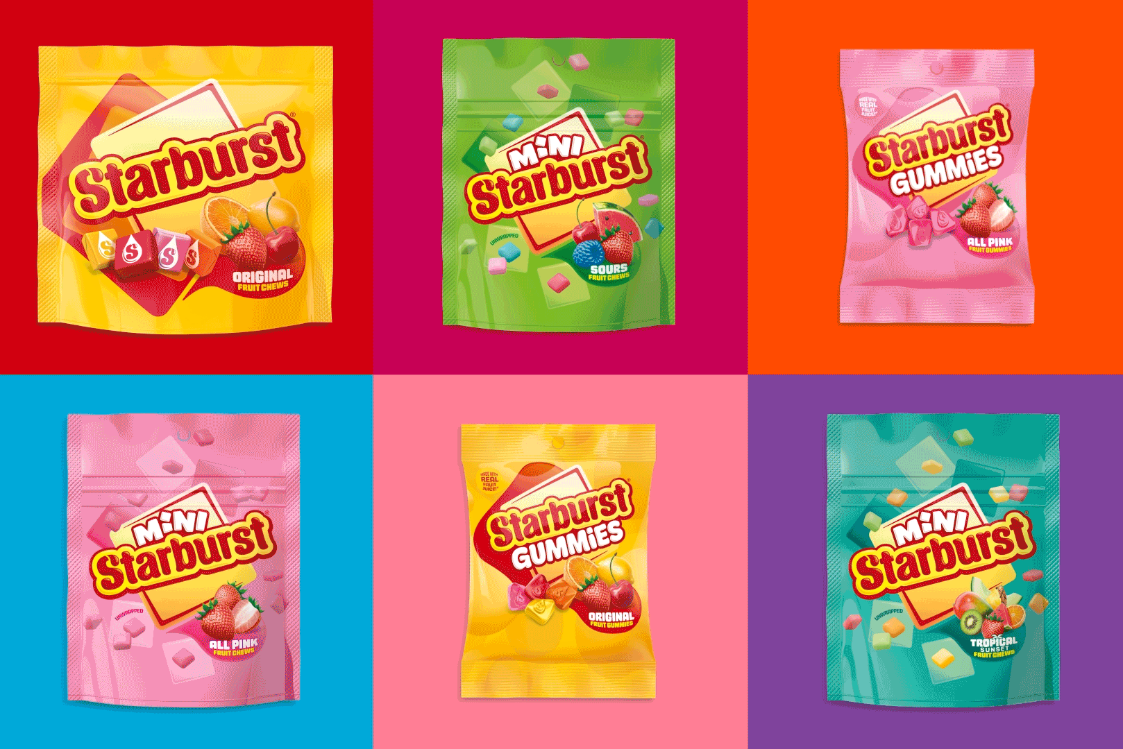
Reclaiming Starburst’s Squarish Joy
Mars’ iconic candy brand was losing clarity. Competitors crowded in, assets drifted, and the youth was looking elsewhere. The brief was bold: win back hearts, reclaim category leadership, and explode off shelves.
Finding the truth hiding in plain sight
Our Connect in Full® methodology always starts with authentic insight. For Starburst, that truth was hiding in plain sight—those perfect squares fans instinctively stack, mix, and reimagine into personal flavour combinations.
We watched people turn candy into self-expression. That behaviour sparked everything: what if we built the entire brand around individuality and endless possibility squared!
Connecting insight to impact
Real transformation happens when you connect insight, strategy, and bold creativity—when every decision ladders back to an authentic brand truth.
The square shape now takes centre stage through an updated wordmark locked into a bold square icon. The signature “juicy drop” remains free to animate communications with bursts of fruit energy. A bespoke, square-inspired typeface mirrors the candy’s shape, delivering punch on shelf and clarity on-screen.
Yellow works harder as a beacon across the range, while clearer palettes make navigating flavor variants effortless. Every element connects back to that core truth: Starburst is about squarish joy you can stack, mix, and make your own.
Building for the future
The refreshed system flexes seamlessly across digital, social, and experiential channels. In a crowded field, Starburst’s true personality now shines—connecting with lifelong fans and first-time tasters alike.
“When design starts with a clear product truth, it creates intangible value that compounds over time,” said Mike Foster, Creative Director. “By unlocking the squarish joy already baked into Starburst, we’ve built a flexible system that lets the brand play bigger, faster, and more memorably wherever it shows up.”
The impact
Consistency, easier range navigation, and a bigger creative canvas fuel innovation for years to come. Starburst strides into the future as an experience-led brand ready to delight the next generation of fruit-loving fans.
The new identity launches first across the U.S. before rolling out worldwide—proving that when insight drives creativity, authentic transformation follows.
See the case study here.
Starburst® is a registered trademark of Mars, Incorporated.
Straight Forward Design is an independent global brand-strategy and design studio. We connect insight, strategy, and bold creativity to build brands people love through our Connect in Full® methodology.